Our journey continues with the biggest shift in the look of our logo since the beginning, when we introduced a new font and shield in 2007–2008.
Part V: Charlemagne, King of Logos (2007–2008)
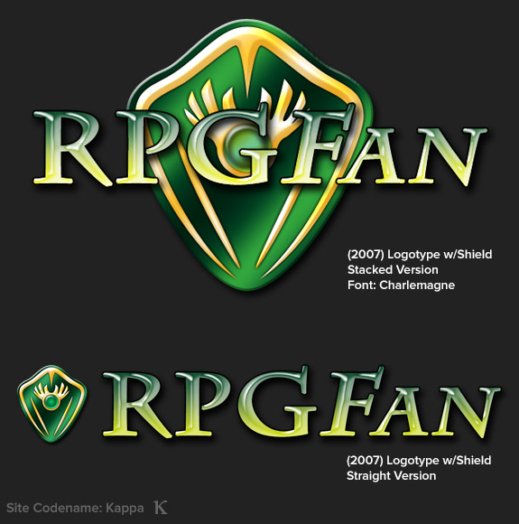
Now we’re talking. In 2007, I finally sat down and came up with a standardized format for our logo in both “stacked” and “straight” variants, to work in a variety of situations. The shield was the same as before, but the new font, Charlemagne, is still what we use today (mostly; more on that later). I chose it because it still has a fantasy feel, and the sweeping leg on the “R” echoed Dauphin a bit, making it a natural transition.
Part VI: The Emerald Shield (2008–2015)
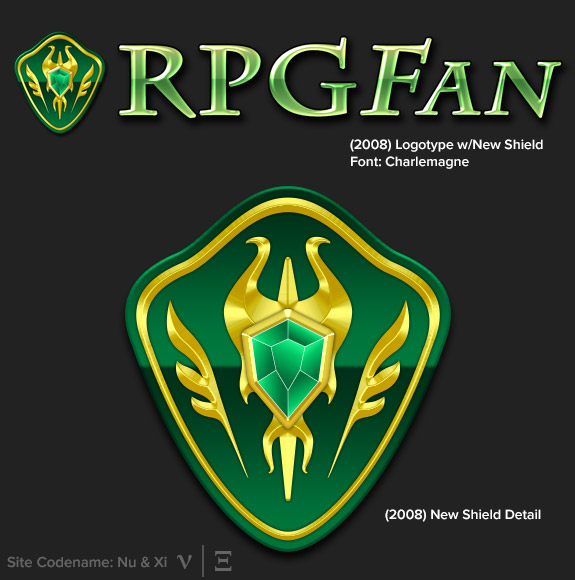
Of course, by 2008, I’d realize a new font wasn’t enough of a transition. The text style had grown stale, and the shield, when placed to the left of the type, was very clearly not meant to stand on its own and needed some sprucing up.
It took many, many attempts before I found shapes I liked. The original “wings” on the first shield were meant to lightly evoke a Hylian shield, but I wanted to get further away from that. I also wanted to make the accents more “gold” than “yellow,” and sharpen them up to look less like the soft bevel of the old version.
This is still the basis for the logo we have now, and 2008 is where it began.
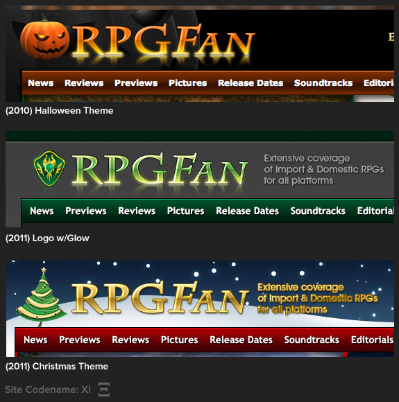
With an updated logo and site layout, I got back in the habit of creating some holiday themed layouts. The actual layouts may be the basis for a later feature, but for now, I’m focusing on the logo variants that accompanied them.
I quite liked the fun pumpkin from 2009 (it would return in 2013), but making a pumpkin that resembled Pyro Jack from the MegaTen games made for a fun 2010 logo.
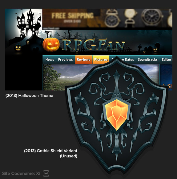
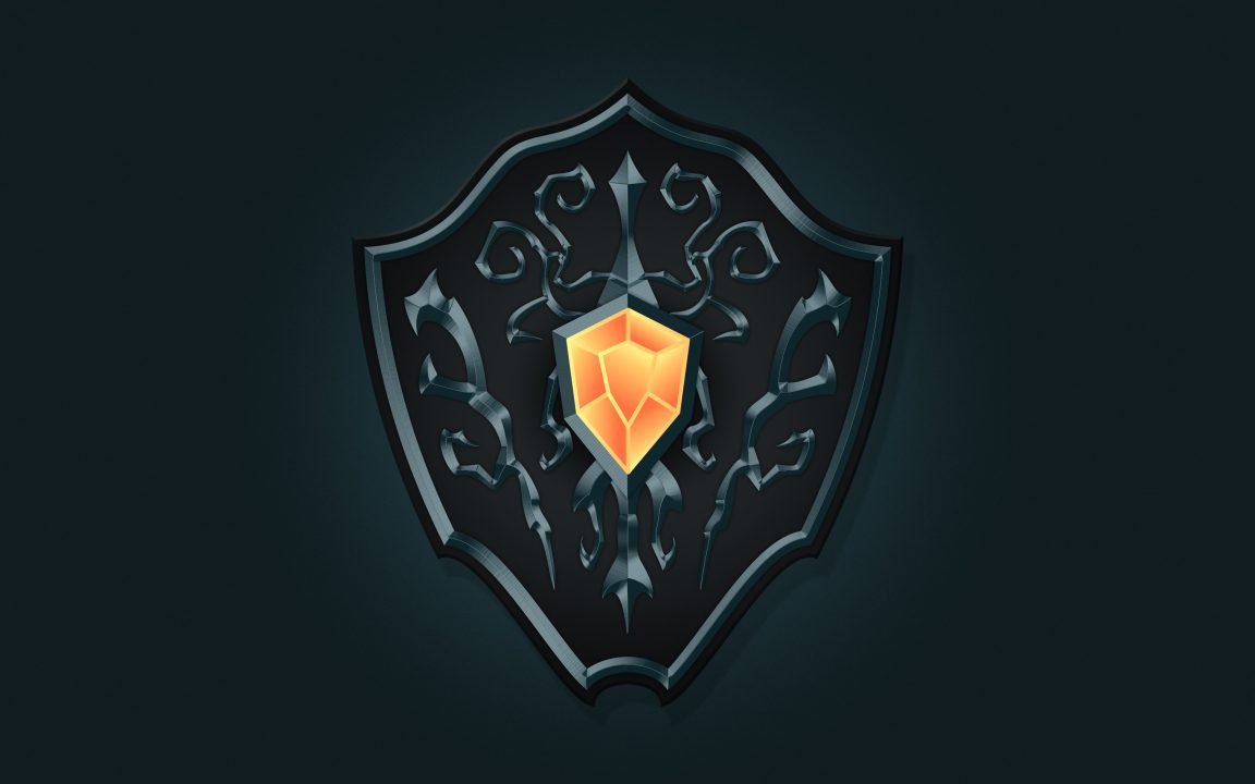
Wow, 2013 was really the last time I created a Halloween theme? My bad. This one was fun, since instead of a typical orange and black Halloween color palette, I wanted to go more gothic with a dreary blue. I was really happy with the crazy gothic shield… until I scaled it down and it was too complicated to really be used in the site design. So, the pumpkin returned, but I made the shield into a wallpaper to get some use out of it! I offered it for download in 2013, and you can get it yourself right here, too:
INTERMISSION 2: Secret Theme Stash (2011; Unused)
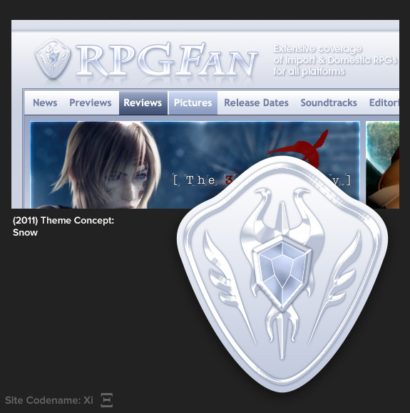
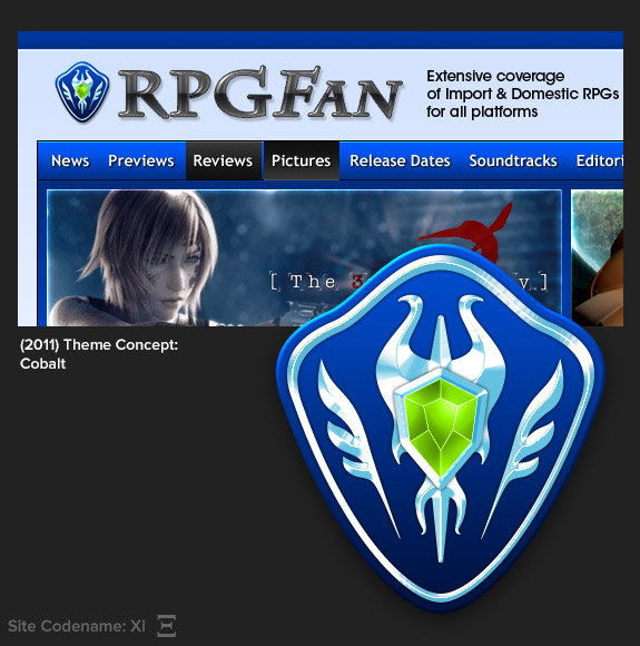
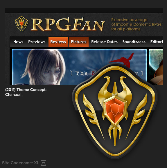
These were so much fun to make. For years, I was trying to change our color scheme at RPGFan, growing tired of working with green. I’d eventually realize the green was key to our identity, but I still liked the option of giving readers selectable themes. These didn’t ultimately happen, because the logistics of maintaining so many graphic elements and CSS files was not something any of us wanted to deal with. Still, I’ve always been fond of the Snow and Charcoal shield styles…
Next, we visit the present day logo and give you a peek at what’s in store for the future. Forward!


