Finally, we arrive at today’s logo and where the RPGFan identity (and logo) is going in the near future.
Part VII: Strip It Down (2015–2018)
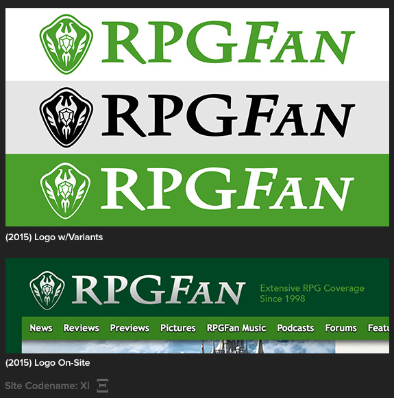
There are many rules and guidelines in logo design, and one really good one to follow is to create something that works in full color, but easily adapts to single-color uses as well. The shield was honestly never designed to work in a single-color application, but with some slight modifications to the jewel at its center, it adapted fairly well! Stripping out the special effects also meant the shield could be used as a subtle background element, for any special site features.
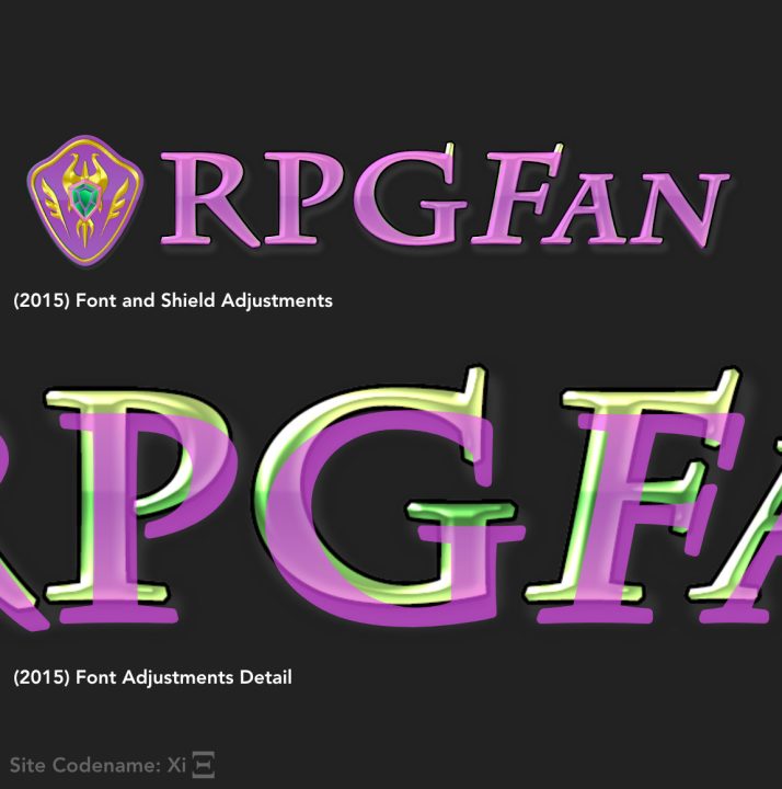
The more subtle modification here was to the text: While still based on Charlemagne, I smoothed over some of the pointy corners, which helped legibility in general, but especially at smaller sizes.
August 6th, 2023 Update: Here is an illustration of these font and shield edits, showing the original version and the cleaner version overlaid in bright pink:
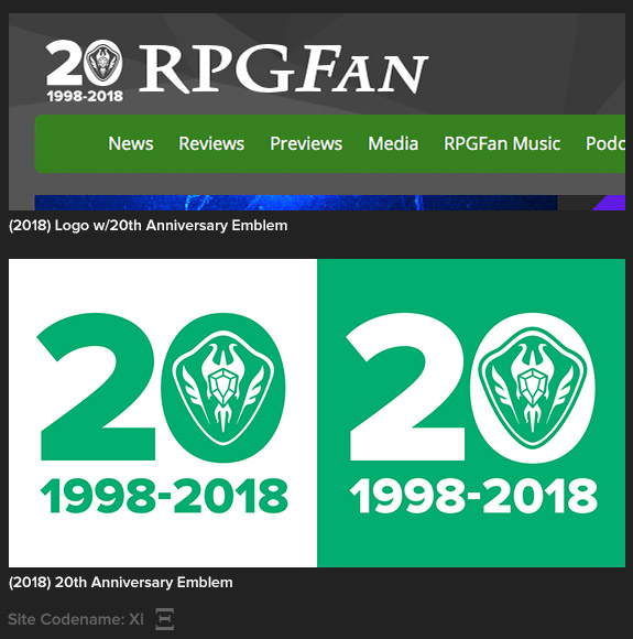
For 2018, the standard shield has been put aside for our 20th Anniversary logo. Like the standard logo, I created two versions of this edition, one for light and dark backgrounds. (The idea is that the shield “accents” are always lighter than their background, hence the need for both styles.)
Part VIII: 3.14159 (2018–???)
And now we get to the future, with a dash of the present! When we began to make serious inroads to building a whole new site at RPGFan (a still ongoing project), I knew it was the ideal time to really change the logo. Charlemagne served us well, but it can get hard to read at small sizes, and really, ten years is a good run for an identity.
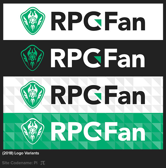
The plan was to not introduce this logo at all until our new site was ready, but thinking on the logistics of changing everything at once, I decided to slowly roll it out in certain places. If you’ve been paying attention, you’ve seen it quietly appear in a few places this year, like our E3 2018 awards, and recently-introduced podcast artwork. Along with this new logo comes two new key elements: the triangle accent on the “G” which doubles as a background element, and a fresh new take on our familiar green color scheme.
No, I can’t show you the new site design yet — gotta keep some stuff secret! — but you can get an idea from these logos. 😉
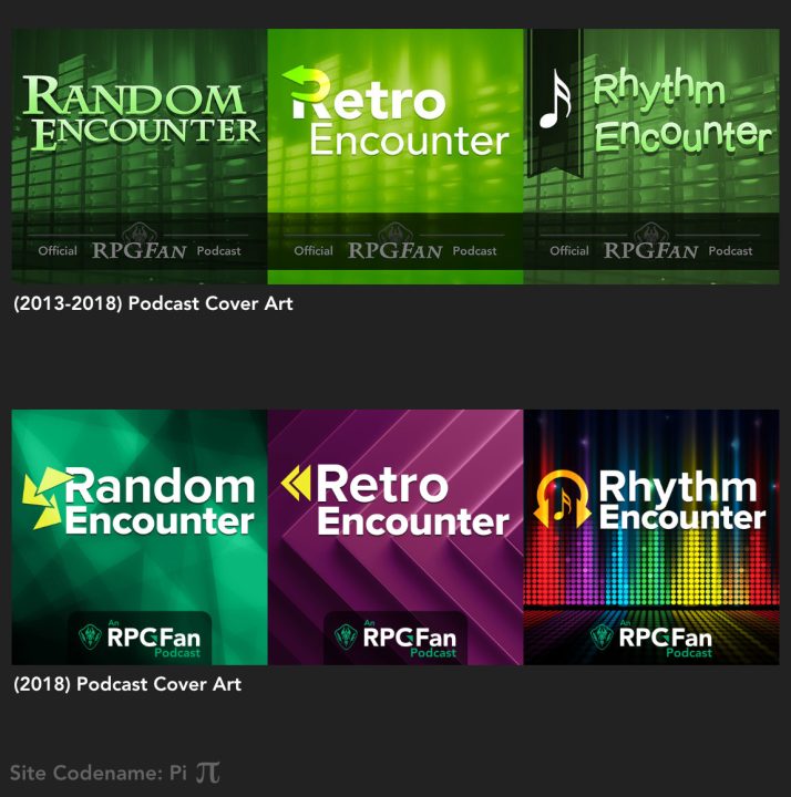
One of the more prominent side effects of the new logo and identity involved updating our podcast artwork and branding. All three podcasts debuted at different times, so I just made up each look as I went along. Several years in, it was a good time to tie the logos together visually, but giving each one a unique color scheme and feel. You may also notice the new triangle accent is the basis for each podcast’s icon. Okay, the Rhythm Encounter cover is still a secret, but you will see that soon enough.
August 6th, 2023 Update: In 2018, Rhythm Encounter had not yet relaunched, so the art was not finalized; we have updated this graphic accordingly!]
Now you know more than you ever needed to know about RPGFan’s storied history of logos! Thank you for taking this journey with me, and for supporting RPGFan for however long you’ve been a reader.


