The tentatively titled Project Triangle Strategy was a standout at February’s Nintendo Direct. A promising SRPG entry into Square Enix’s HD-2D series that started with Octopath Traveller, Project Triangle Strategy looks to evoke classic politically charged SRPGs like Final Fantasy Tactics and Tactics Ogre. And hey, it’s shaping up pretty dang well from the early demo! But talking about the gameplay merits of the game is on someone else’s shoulders. Today I’m looking at one of the cooler utility features in the demo and why 3-4% of us might not even realize it exists.
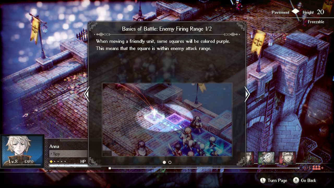
After a bit of a story crash course, the demo gets into combat and lays down a few rapid-fire tutorials to get you up to speed as you join the game in medias res, six chapters in. One of the nicer features on the rise in strategy RPGs, Project Triangle Strategy included, is a little movement ditty that looks something like this.

If the accompanying image is a little confusing to you, you’re not alone. Nearly 5% of the world’s population has some type of colorblindness, with the most common types generally falling into the red-green colorblindness category. For many folks living with colorblindness, red hues can be difficult to process, even if they’re mixed into other colors. This can make reds look green, but more relevant here, it can take the red out of purples, making them look blue.
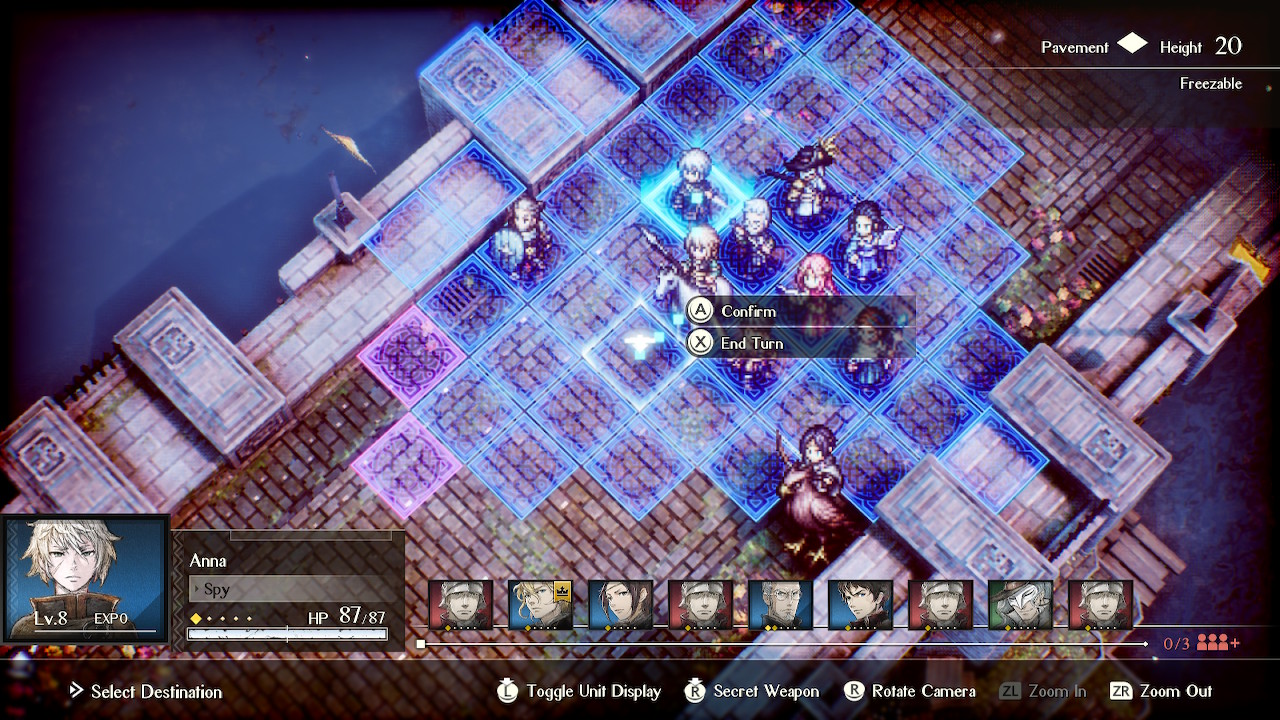
In Project Triangle Strategy, this means that the standard blue movement squares and the threatened purple movement squares can appear indiscernible to players like myself. When I saw this tutorial, I knew I was about to run afoul of another game mechanic utterly lost on me, the latest in a long list of accessibility slip-ups that make games just a little less welcoming to folks with different requirements. This was the first time in a while that I found myself completely lost. I turned the camera. I took screenshots. I squinted and switched to handheld mode to try to get the right camera angle that’d show the difference in colors to my special eyes, but to no avail.

I showed the above screen to my spouse eventually, wondering if I had just misinterpreted the hint and there was no difference. With no context at first glance, she responded, “What are the purple squares for?” Which goes to show exactly how intuitive the feature is at a glance, and just how unfortunate that it’s utterly lost to a subset of players.
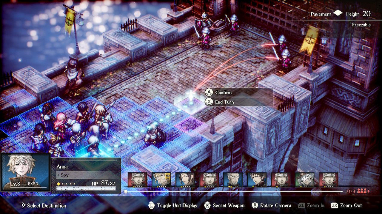
None of this is to sell the game short. In fact, the issues Project Triangle Strategy has with colorblind accessibility are less severe than most. When you move a character to one of those threatened spaces, red lines connect potential attackers to your character, giving a second bit of visual feedback to movement. It’s slower and more cumbersome than a quick glance, adding a few seconds of experimentation to each movement that adds up over the course of a lengthy SRPG, but it’s better than nothing. And as an early demo with a forthcoming opinion survey, there’s every chance that enough feedback might prompt a color configuration option to make this feature readily useful to a broader group of players. But after spending over 30 years dealing with colorblind gaming, I try not to get my hopes up too high, because more often than not, colorblind players are left to find their own workarounds.

Like I said, this isn’t the most extreme example of colorblind accessibility woes in the RPG world: it’s simply the latest. At launch, The Witcher 3: Wild Hunt had red witcher sense highlights that disappeared into the greenery of the world, leaving me to play with a helper whenever I needed to track down a beast or bandit. I was thankful when configuration options were added, allowing players to change witcher sense colors to meet their visual needs. Most of the time, however, we’re a little less lucky.
In CrossCode, color-based boss shields turn exciting fights into frustrating brute force walls throughout the game. In Persona 5 Royal’s new dungeon, a color mixing puzzle used to activate walkways and doors grinds the game to a halt as puzzle solving becomes trial and error. I didn’t even realize that Yakuza: Like a Dragon had a UI element to let you know if a skill carried over to other jobs until a friend let me know that there were different colored dots next to each skill.
None of this is new, of course. From the color-based puzzles of Lufia II’s fascinating dungeons to the nigh-invisible Judgement Ring strike zones in the original Shadow Hearts, colorblind accessibility has been a challenge… well, ever since games have had color. The games I’ve listed aren’t terrible for failing to address those issues. They’re all games I either love or want to love but are affected by accessibility limitations. With such a small percentage of gamers being colorblind, and such variation in limitations even within that percentage, colorblind accessibility generally doesn’t become a focus.
But it can. The difference between accessibility and inaccessibility is usually pretty minor. Don’t rely on color alone: give us a symbol or animation, or even just a different outline. Let players configure the critical colors in the UI. The overarching rule for accessibility is nearly universal: if your interface requires a specific sense to function, try to provide that input so a second sense can detect it as well. Follow the lead of the handful of developers adding colorblind accessibility options and color-agnostic UI to their games. Accessibility is a challenge, but it’s a worthy one.


